 listicle
9 Interior Paint Colors for Aurora Homes in 2026
Last Updated: October 24, 2026
Quick Summary
The best interior paint colors for Aurora homes account for the region's bright, clear light at 5,280 feet elevation and room orientation. Warm whites, creamy off-whites, beige, greige, and sage green perform well across different room exposures, while testing paint samples on all four walls at different times of day prevents costly mistakes.
- Aurora's elevation of 5,280 feet means stronger UV rays and clearer skies that affect color perception year-round
- Sage green ranked in the top tier across every room type according to Zillow's analysis of paint colors for home sales
- North-facing rooms receive cool, steady light that can make warm colors appear dull, while south-facing rooms get warm, intense light that can oversaturate colors
- Test paint samples on all four walls and observe them at different times of day before committing to a color
- Use the same paint color or closely related shades on all walls visible from one vantage point in open floor plans
Table of Contents
- How Local Light and Room Orientation Shape Interior Paint Colors
- Best Neutral Paint Colors for Interior Walls in Aurora Homes
- Sage Green and Muted Green Paint Colors for Every Room
- Paint Colors for Dark Rooms and Low-Light Spaces
- How to Choose Interior Paint Colors That Coordinate Across Your Home
- Whole House Paint Color Ideas for Connected Spaces
- Testing Paint Colors Before Committing to Your Walls
- Getting Professional Help With Your Interior Paint Project
- Frequently Asked Questions
How Local Light and Room Orientation Shape Interior Paint Colors
The color you see on a paint chip in the store won't look the same on your walls at home.
Room orientation determines which direction sunlight enters your space. North-facing rooms receive cool, steady light that can make warm colors appear dull and cool colors feel cold.
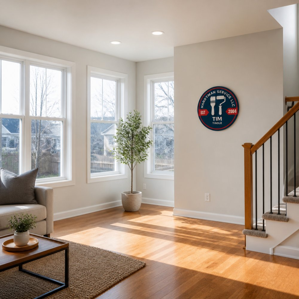
Aurora sits at 5,280 feet elevation in Colorado, which means stronger UV rays and clearer skies than lower elevations. This affects color perception year-round.
The best interior paint colors for Aurora homes account for these light patterns. Test paint samples on all four walls of a room and observe them at different times of day.
Best Neutral Paint Colors for Interior Walls in Aurora Homes
Neutral colors form the foundation of most homes because they adapt to changing light and coordinate easily across rooms. For Aurora homes, certain neutrals perform better than others due to how local light interacts with their undertones.
Warm Whites and Creamy Off-Whites
Warm whites and creamy off-whites are the safest choice for most Aurora interiors because they reflect light without appearing stark or cold. These colors work in every room orientation and stay consistent throughout the day.
Warm whites contain subtle yellow, beige, or gray undertones that prevent them from looking clinical. Creamy off-whites add more warmth and can feel inviting in living spaces and bedrooms. In north-facing rooms, these colors prevent the cool light from making your walls feel institutional. In south-facing rooms, they maintain their warmth without becoming too yellow.
When choosing a warm white or creamy off-white, avoid pure whites that contain blue undertones. How to Choose the Right Paint Finish for Kitchen Walls helps you select finishes that complement your color selections. These can look harsh in Colorado's intense light and feel cold in winter months. Instead, select colors with names suggesting warmth: vanilla, cream, ivory, linen, or natural.
Beige, Greige, and Soft Earth Tones
Beige bridges warm and cool tones, making it exceptionally versatile for interior paint colors across different room exposures. True beige contains equal parts warm and cool undertones, so it adapts to whatever light enters the room.
Greige, a blend of gray and beige, has gained popularity because it feels more sophisticated than pure beige while remaining neutral.
Soft earth tones like mushroom, warm taupe, and muted tan provide subtle color while maintaining neutrality. These tones work beautifully in kitchens and bathrooms where you want personality without commitment to a specific color family.
Test beige, greige, and earth-tone samples in your actual rooms before committing. These colors can shift dramatically between north and south-facing walls, and what looks perfect in one room might feel too warm or too cool in another.
These neutral paint colors perform well in Aurora homes due to how local light interacts with their undertones.
| Color Type | Best For | Key Characteristic |
|---|---|---|
| Warm whites and creamy off-whites | Every room orientation | Reflect light without appearing stark or cold |
| Beige | Different room exposures | Bridges warm and cool tones, exceptionally versatile |
| Greige | Master bedrooms and living areas | Feels sophisticated while remaining neutral |
| Soft earth tones | Kitchens and bathrooms | Provides personality while coordinating with wood and stone |
Sage Green and Muted Green Paint Colors for Every Room
Sage green has emerged as the most versatile colored paint choice for interior walls because it performs well in every room orientation and coordinates with virtually every design style. According to Zillow's analysis of paint colors for home sales, sage green was the only shade analyzed that ranked in the top tier across every room type.
Sage green contains gray undertones that prevent it from feeling too bright or botanical. In north-facing rooms, sage green maintains its sophistication without becoming muddy. In south-facing rooms, the gray undertones keep it from shifting toward yellow-green. This color works in bedrooms, living rooms, kitchens, and bathrooms.
Muted olive and soft green-blue tones offer alternatives to sage for homeowners seeking something slightly different. Olive feels warmer and more grounded than sage, making it ideal for cozy spaces like dens or reading nooks. Green-blue (sometimes called seafoam or celadon) feels cooler and more serene, working well in bedrooms and bathrooms where calm matters most.
Avoid bright, saturated greens that can feel overwhelming in Colorado's intense light. Stick to muted, desaturated versions that feel natural and timeless. The best interior paint colors in the green family contain enough gray to feel sophisticated rather than playful.
Paint Colors for Dark Rooms and Low-Light Spaces
Basements, interior hallways, and north-facing rooms without much window area need strategic color choices to feel bright and inviting rather than cave-like.
Light, warm colors make dark rooms feel larger and more welcoming. Pale creams, soft whites, and very light warm grays work better than stark whites, which can feel harsh under artificial light.
Consider the light source in dark rooms. If your space relies on warm-toned artificial lighting, choose paint colors with warm undertones to match. If you have cool-toned LED lighting, you can go slightly cooler with your paint. The goal is harmony between natural and artificial light sources.
For dark rooms, muted warm neutrals perform better than any colored paint. A very pale warm beige or cream in a dark room feels more spacious than a darker neutral or any saturated color. Pair light walls with bright trim and adequate task lighting to maximize the sense of openness.
How to Choose Interior Paint Colors That Coordinate Across Your Home
Coordinating interior paint colors across your home creates flow and prevents visual chaos when moving between rooms. The key is selecting colors that share similar undertones and light-reflective qualities.
Start by identifying whether you prefer warm or cool undertones throughout your home. Warm undertones (yellows, reds, oranges) work well together. Cool undertones (blues, purples, greens) coordinate naturally.
Call 720-989-4123 for a free estimate →
Choose a primary neutral for 60-70% of your home's walls. This might be a warm white, greige, or soft beige. This primary color anchors your palette and makes your home feel cohesive.
Benjamin Moore's guidance on paint colors for different room exposures notes that north-facing rooms receive cool light, which affects how colors appear compared to south-facing spaces.
The best interior paint colors work together because they share undertone families and respond similarly to Aurora's bright, clear light. Avoid selecting colors in isolation from paint chips.
Whole House Paint Color Ideas for Connected Spaces
Open floor plans and connected living spaces demand thoughtful color coordination because you see multiple walls simultaneously. A color that works alone can feel chaotic when viewed next to a contrasting color.
For open living areas, use the same paint color or very closely related shades on all walls visible from one vantage point.
When you want subtle variation in connected spaces, choose colors from the same undertone family but in different depths.
Accent walls work best in spaces that are visually separated from the rest of your home. A sage green accent wall in a bedroom reads as intentional. The same sage green accent in an open floor plan can feel disjointed and overwhelming.
Consider traffic flow and sightlines when planning whole-house color schemes. Colors visible from multiple rooms should coordinate. Colors hidden from main sightlines can be bolder or more distinct without disrupting your home's overall feel.
Testing Paint Colors Before Committing to Your Walls
Paint is one of the most affordable ways to transform a room, but choosing the wrong color wastes time and money. Testing colors before committing prevents expensive mistakes.
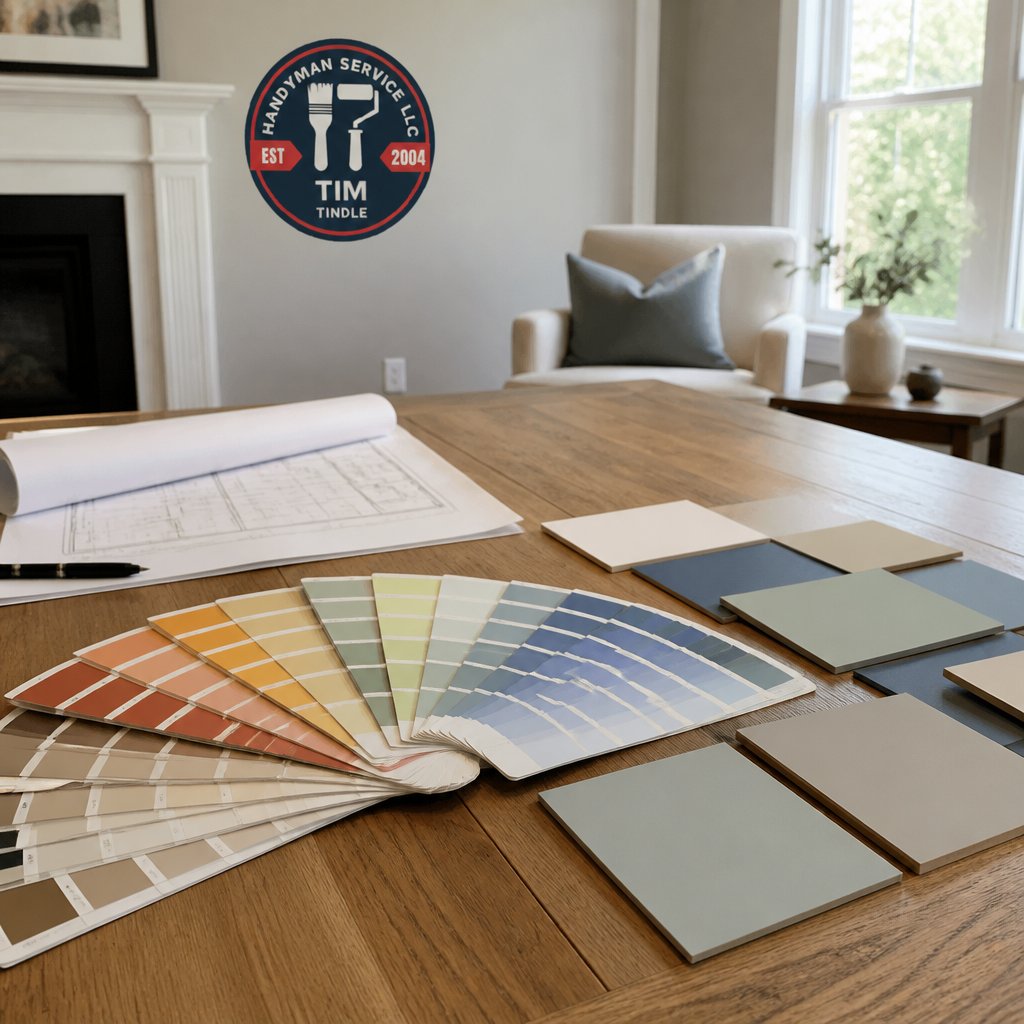
Purchase sample-size paint containers in your top color choices. Paint large swatches (at least 2 feet by 3 feet) on each wall of the room you're painting.
Live with your swatches for at least 3-5 days. Colors that seem perfect on day one might feel wrong after a week of observation. Your brain adapts to colors over time, and what initially feels bold can become comfortable, or vice versa.
When testing colors, paint swatches on all four walls if possible. North-facing walls will show the color differently than south-facing walls. East and west-facing walls will display the color differently at different times of day. This testing process takes time but prevents costly repaints.
You'll need enough sample paint to cover the swatch area thoroughly. How to Calculate How Much Paint Is Needed for a Room helps you determine the right quantity for your test swatches.
Document your testing process with photos. Take pictures of each swatch at different times of day under different light conditions. These photos help you remember how colors looked and make it easier to discuss your choice with a professional painter.
Getting Professional Help With Your Interior Paint Project
Once you've selected your interior paint colors, professional application ensures a polished, lasting result. Interior painting requires proper surface preparation, technique, and quality materials to achieve the finish you're envisioning.
A professional painter assesses your walls, prepares surfaces properly, applies primer if needed, and applies paint in thin, even coats. This expertise prevents common problems like uneven coverage, visible brush marks, and premature peeling.
When hiring a painter, discuss your color selections and the specific look you want to achieve. Share your paint swatches and photos from your testing process.
Handyman Service Aurora provides professional interior painting services throughout the Denver Metro area. Our team handles surface preparation and expert application to transform your rooms. Handyman Service Aurora's interior painting services cover everything from single rooms to whole-house projects, and we offer free estimates so you understand the scope and investment before work begins.
Quality interior paint application takes time. A professional painter working carefully produces better results than rushing through the project yourself.
Choosing the right interior paint colors for your Aurora home requires understanding how local light affects color perception, testing samples thoroughly, and coordinating colors across connected spaces.
Frequently Asked Questions
What are the most popular interior paint colors for homes right now?
Warm neutrals dominate current trends, with more than a third of homeowners preferring soft creams, grays, and beiges. Sage green stands out as a versatile choice that ranks well across every room type. Muted earth tones, including soft greens and warm grays, are also gaining popularity for their calming effect and ability to complement various home styles.
How do I choose interior paint colors that work with my home's natural light?
Start by observing how sunlight moves through each room at different times of day. North-facing rooms receive cool light, so warm whites and creamy off-whites prevent the space from feeling cold. South-facing rooms get warm light, making cool-toned neutrals and soft greens more effective. Test paint samples on your walls for at least 24 hours to see how they appear under your home's specific lighting conditions.
What paint colors make a small room look bigger?
Light colors, especially warm whites and soft creams, reflect light and create an illusion of more space. Avoid dark, saturated colors that absorb light and make rooms feel smaller. Sage green and other muted greens work well in smaller spaces because their soft undertones remain calming without overwhelming the room. Consistency in color across connected spaces also enhances the sense of openness.
Should interior paint colors be the same throughout my house?
You don't need identical colors everywhere, but maintaining cohesion matters. Choose a unified color palette with 2-3 base colors that work across your home's connected spaces. Warm neutrals like beige and greige transition well between rooms, while accent colors like sage green can define specific areas. Test how colors appear in adjacent rooms with different light exposures before painting.